Bootstrap Responsive Layout
In this tutorial you will learn how to create responsive web designs or layouts with Bootstrap framework.
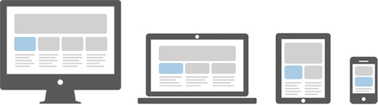
What is Responsive Web Design or Layout
Responsive web design is a process of designing and building websites to provide better accessibility and optimal viewing experience to the user.
With the growing trend of smart phones and tablets, it has become almost unavoidable to ignore the optimization of sites for mobile devices. Responsive web design is a preferable alternative and an efficient way to target a wide range of devices with much less efforts.
Responsive layouts automatically adjust and adapts to any device screen size, whether it is a desktop, a laptop, a tablet, or a mobile phone.
Creating Responsive Layout with Bootstrap
With the new Bootstrap 3 mobile first grid system creating the responsive and mobile friendly websites has become much easier. As opposed to previous version you don't need to include any additional style sheet to enable responsive feature. Bootstrap 3 is responsive and mobile friendly from the start. Its four tiers grids classes provides better control over the layout as well as how it will be rendered on different types of devices like cell phones, tablets, desktop and laptops, large screen devices etc.
No comments:
Post a Comment